Services
- Logo Design
Summary
Background
Cohearity is a leadership and decision-making consulting firm. The founders - Jim Driscoll and Jordan Stephens - are seasoned practitioners with decades of experience consulting inside one of the top tech manufacturers. After years of success in one tech giant, the founders launched Cohearity to bring their approach to other companies. They contacted MGalen Design to create a logo that elegantly represents their values and work.
Challenge
The challenge was to design a logo that felt both warm and inviting, while being familiar to corporate leaders. Cohearity’s work sits at the intersection of strategic decision-making and healthy team dynamics, requiring a visual identity that conveyed clarity, trust, and warmth. Listening, growth, and creating space for diverse voices emerged as key brand qualities. The question became: what does a simple, memorable logo look like that holds all of this at once?
Results
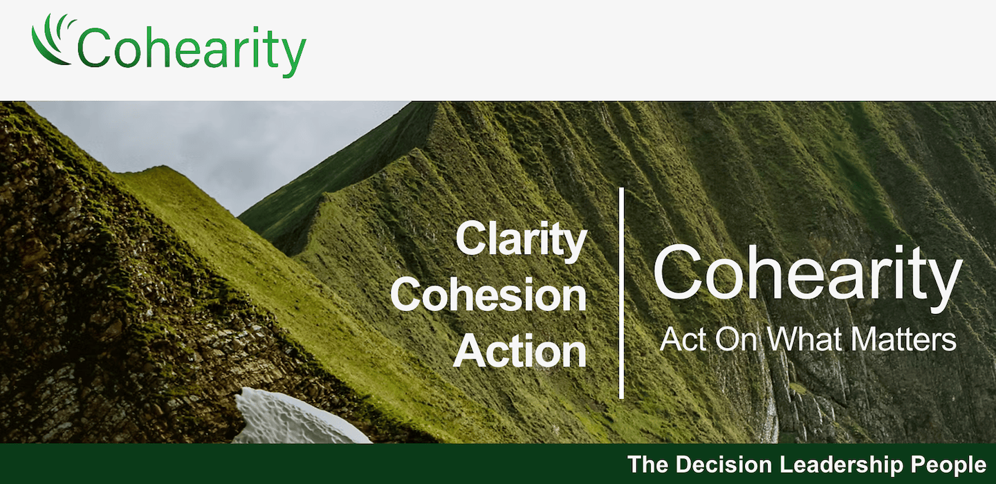
Through iterations and feedback, we landed on a logo none of us would have predicted, but hits the mark beautifully. It uses curved lines that reference sound waves and listening or taking in information. Those lines are then arching up, creating space for the ‘C’, relating to the way their leadership training makes space for all voices to be heard. The typeface is neutral and clean, with a tall X-height, making it highly legible at a small scale. The colors are a saturated green gradient, showing evolution and growth.
"[Michael] was skillful at blending our input with his own original ideas"
Jordan Stephens | Cohearity Co-Founder
Process
Strategy & Research
We always start with a discovery meeting to establish the brand personality, aesthetic preferences, and target audience. Then, add-in market research. With a mood board to guide us, we created a few directions to pursue: sound/signal waves, circular sound graphs, and initialisms.

Design
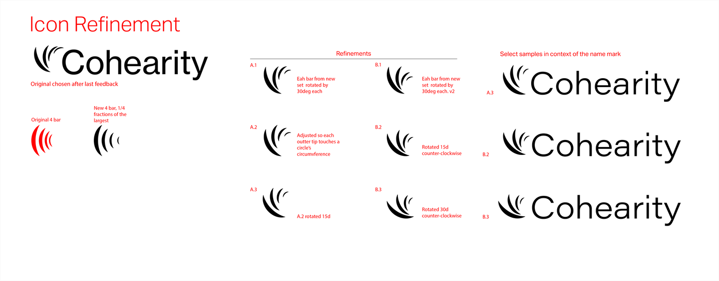
Each concept was developed to a level of recognizable clarity without over-polishing, allowing us to evaluate direction rather than details. The first round ruled out initial-based marks, narrowing the focus to sound wave and circular graph ideas. From there, we honed in on the four curved signal lines as the strongest visual metaphor.
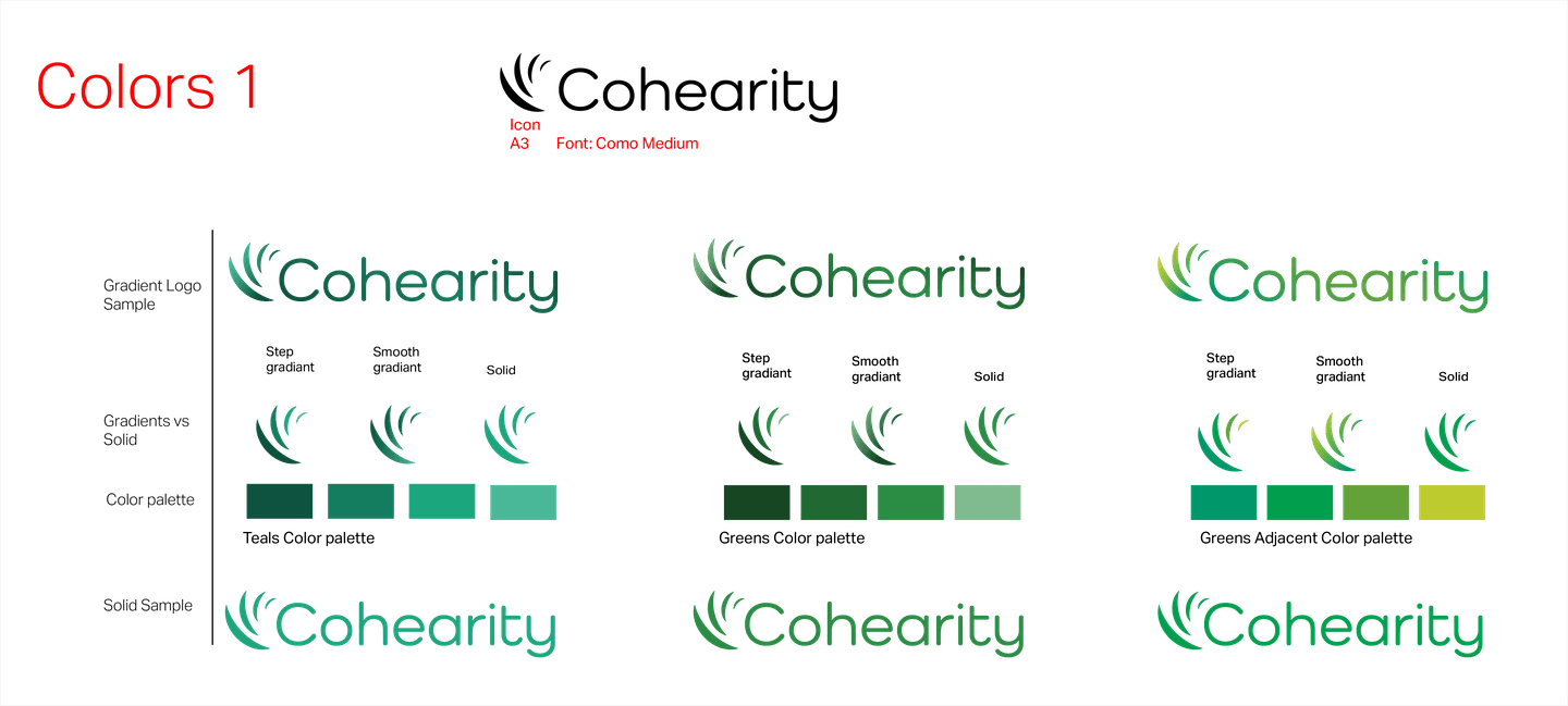
As the icon took shape, we curated a focused selection of typefaces that aligned with the founders’ preference for a neutral, contemporary sans-serif. Rather than overwhelming the client with options, we presented a refined set and adjusted weight and width based on feedback. Color palette explorations followed, culminating in a confident “yes” on the final green gradient.
Launch
Cohearity’s founders - Jim and Jordan - were enthusiastic about the final logo! It feels contemporary with an icon reaching up and a subtle green gradient. It’s familiar and professional to the tech manufacturing industries, yet warm and friendly. There’s a confidence and skill represented in its minimalism and precision.
"We at Cohearity had a great experience working with Michael.” … together we found a logo we love and are proud to share."
Jordan Stephens | Cohearity Co-Founder

