Services
- UX/UI Design
- Web Development
- Accessibility
- SEO
- WordPress CMS
Summary
Background
Common Ground Advisers (CGA) is a veteran-led consulting firm working at the intersection of policy, government operations, healthcare systems, and justice. The founding team brings decades of experience and a perspective shaped by service and lived experience.
CGA came to MGalen Design to build a new website for their consulting practice. Their market research, audience strategy, and content direction were already established, as was the visual identity created by designer Saphya. My role was to translate these foundations into a polished, functional website.
Challenge
The website needed to establish credibility quickly, communicate CGA’s value clearly, and guide potential clients toward making contact. At the same time, the site needed to be accessible to users with a range of visual and motor abilities.
The biggest constraint was time. CGA needed the website within five weeks so they could begin contacting leads and responding to RFP opportunities. We kept the process focused and efficient, completing the project in two rounds of feedback and iteration.
Results
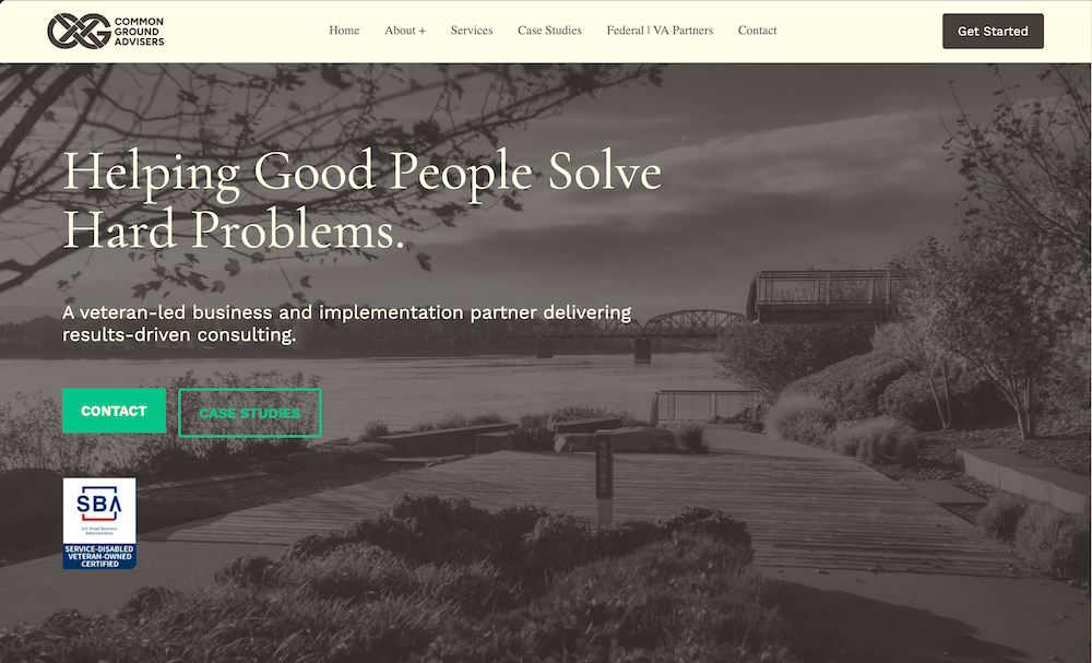
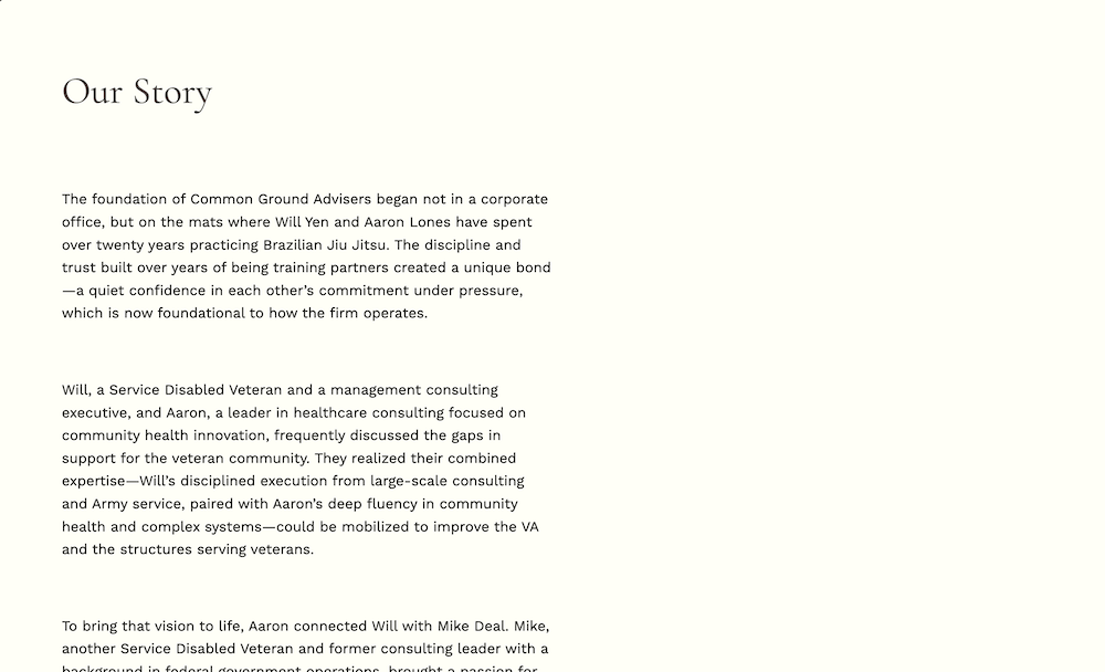
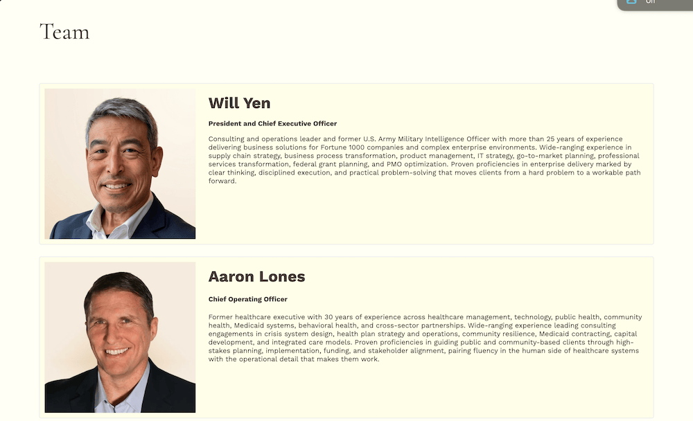
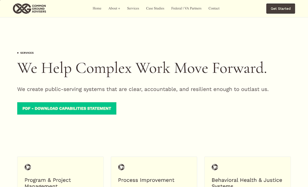
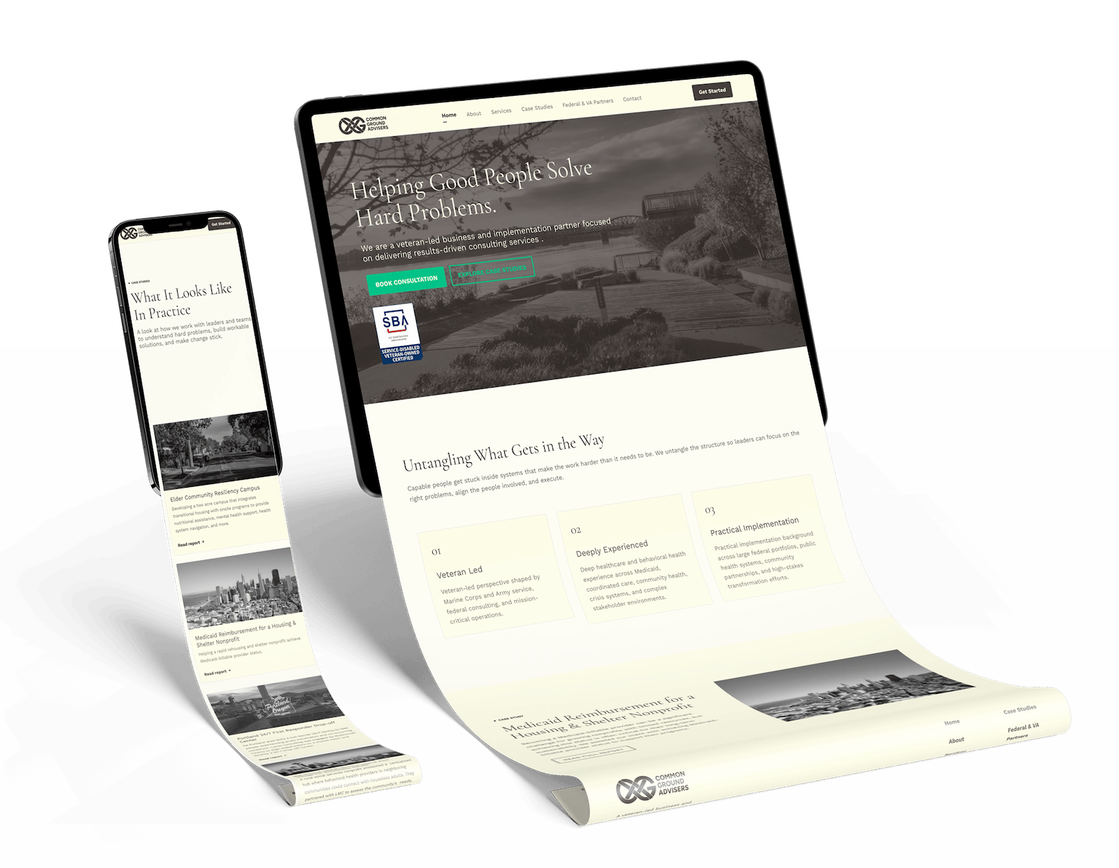
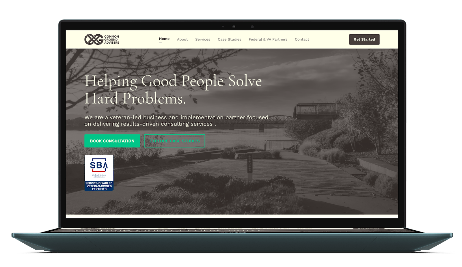
The finished website feels like a calm Ivy League journal: professional and authoritative, but warm and approachable. Cream tones, generous spacing, and restrained typography create a vintage-inspired aesthetic while clear information hierarchy keeps the experience focused.
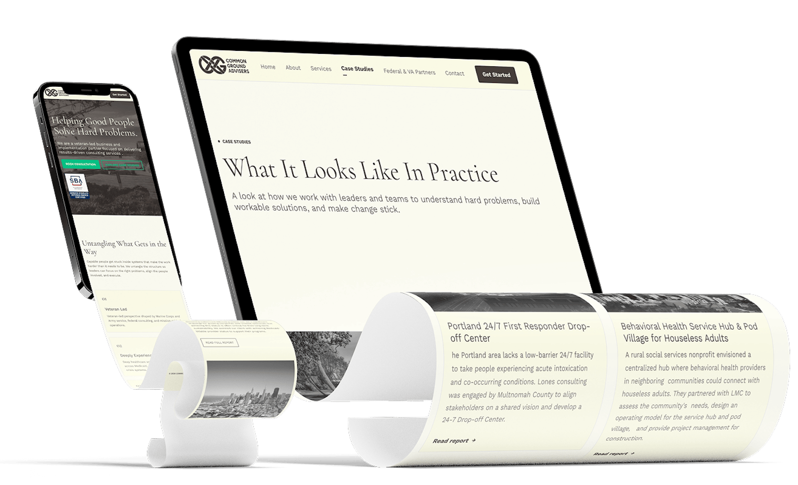
The site is fully responsive, accessible, and built in WordPress so CGA can manage their own content. Clear pathways guide visitors toward CGA’s core business goals, while the final design balances a substantial amount of information with a calm, easy-to-navigate experience.
How it All Went
Process
Brand Handoff → Website Design → Prototype → Development → Testing & Launch
This project began with a strong strategic and visual foundation. With the brand direction and audience research already established, I was able to focus on translating those elements into an effective website.
Strategy
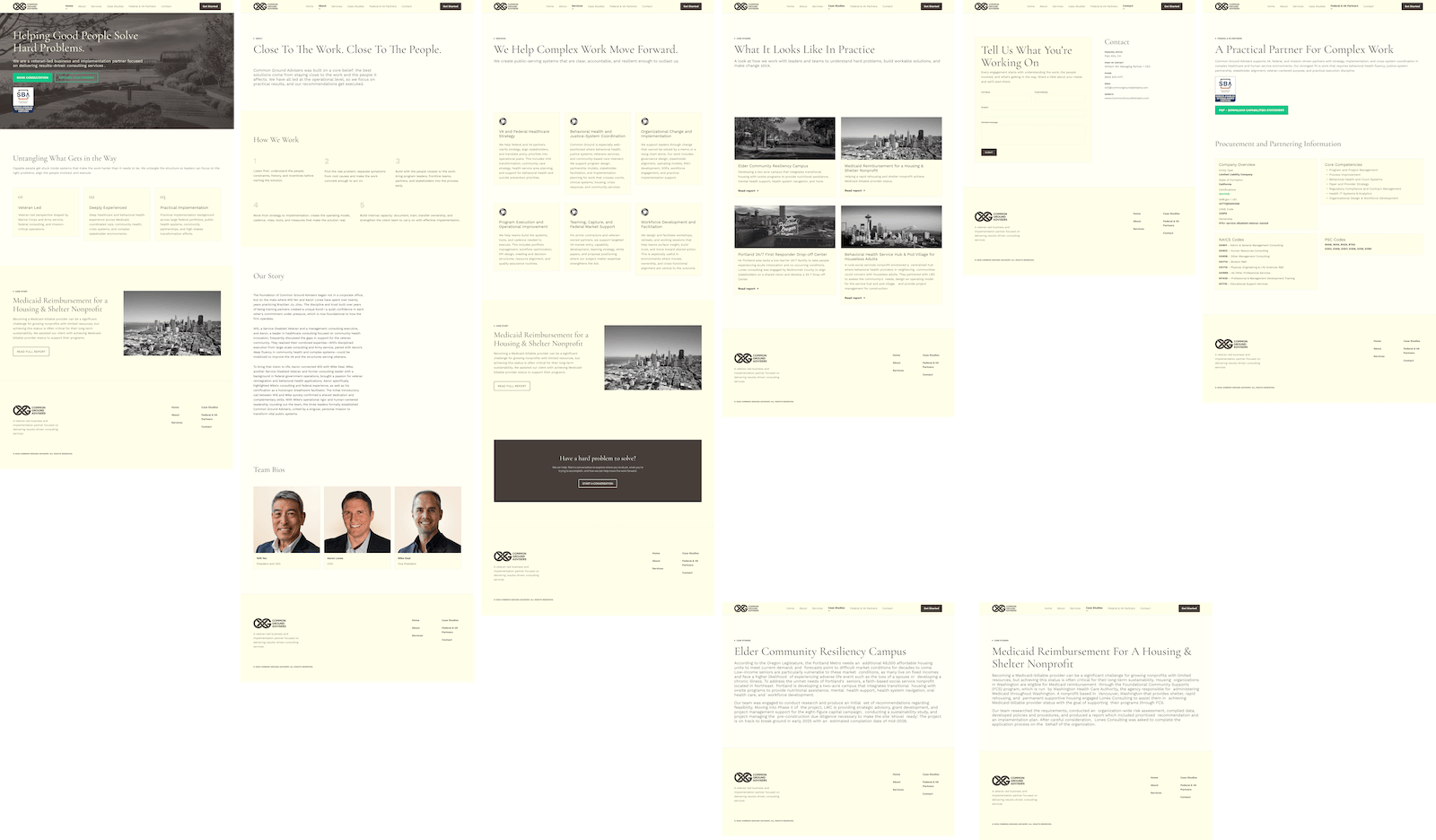
CGA had already defined their audiences, business goals, positioning, and content strategy. I used this existing work to shape the site's information architecture and user flows.
The focus was on making important information easy to find and creating clear pathways from understanding CGA’s services to making contact.
Design
The visual direction was established in collaboration with designer Saphya, who developed CGA’s logo, colors, typography, and broader brand aesthetic.
I translated that system into the website, using generous spacing, subtle visual transitions, and clear content hierarchy to create a calm and focused experience. Accessibility was built into the design from the beginning, including larger typography, strong contrast, generous touch targets, and affordances that don't rely on color alone.
Development
CGA requested WordPress so their team could make updates themselves. I used custom code blocks alongside the CMS to achieve a more refined level of design and interaction than standard WordPress widgets allowed, while keeping the site easy for the client to manage.
The five-week build included responsive development, contact forms, spam protection, SSL, SEO, automatic backups, analytics, and accessibility testing. After two rounds of feedback and iteration, the site was tested across devices and launched on schedule.
Results
The result is a polished, accessible website that establishes CGA’s credibility and makes its services easy to understand and engage with. Built in WordPress, it also gives the CGA team the flexibility to manage the site as their practice grows.