Services
- UX/UI Design
- Web Development
- Accessibility
- Multilingual Support
- SEO
- CMS
Summary
Background
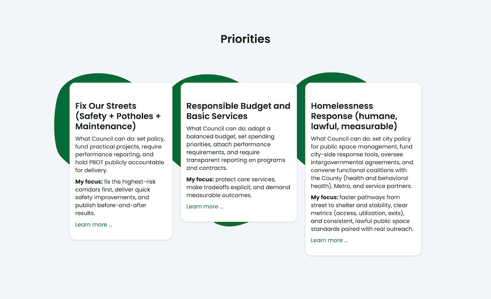
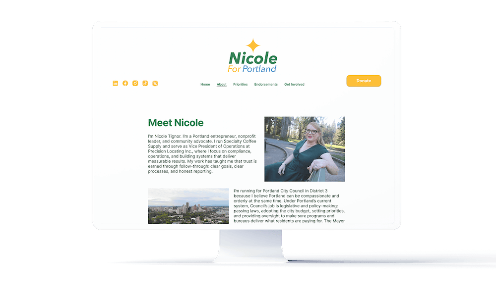
Nicole Tignor is an Oregon-based entrepreneur, nonprofit leader, and community advocate who was preparing a campaign for Portland City Council. The campaign came to MGalen Design with an established logo, color palette, clear goals, and defined audiences. The website needed to give voters and potential donors an easy way to learn about Nicole and her campaign while making contributions accessible.
Challenge
The project had an ambitious timeline: the full website needed to be completed in less than two months. At the same time, the campaign needed to begin fundraising immediately.
The site also needed to serve a diverse audience with different languages, backgrounds, devices, and levels of technical fluency. The goal was to make the experience simple and accessible while giving visitors clear pathways to learn about the campaign and contribute.
Results
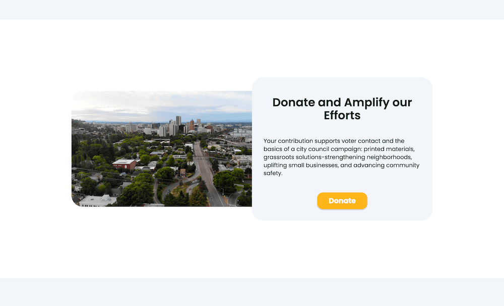
We divided the project into two stages. The first launched as a streamlined single-page site with essential information and a direct path to the campaign's donation platform, allowing fundraising to begin while the full website was still in development.
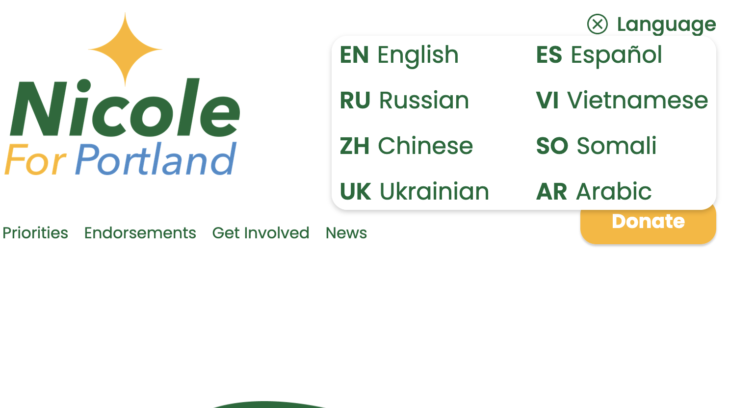
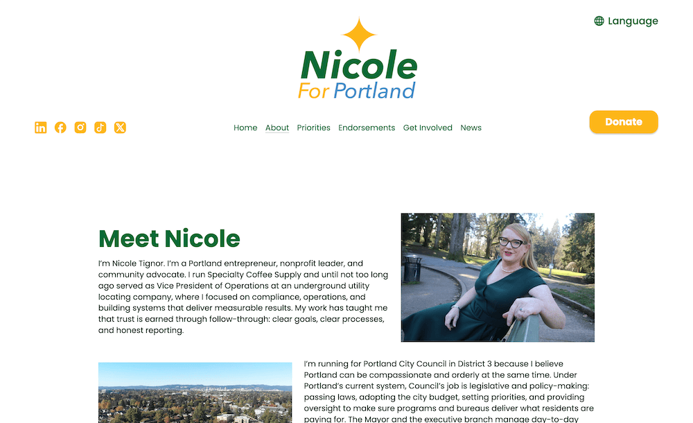
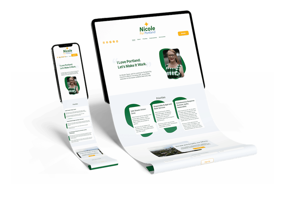
The completed site expands that foundation into a cohesive, multilingual experience. Generous whitespace, organic shapes, and clear information hierarchy create a clean and approachable interface. A custom translation interface integrates Google Translate into the design, providing access to major languages spoken in the city.
The campaign team was thrilled with the result, and the website launched on schedule.
How it All Went
Process
Research & Strategy → Low-Fidelity Design → High-Fidelity Design → Stage 1 Launch → Stage 2 Development → Testing & Launch
Strategy
The campaign came to the project with a clear brand foundation, audience, and primary goals already established. The website brief identified campaign donors, voters researching the candidate, and organizations considering endorsements as key audiences.
Rather than overcomplicating the first version, we prioritized the most important user actions and built the project around them. Fundraising was the immediate priority, which led to the decision to launch a simple first-stage website before developing the full experience.
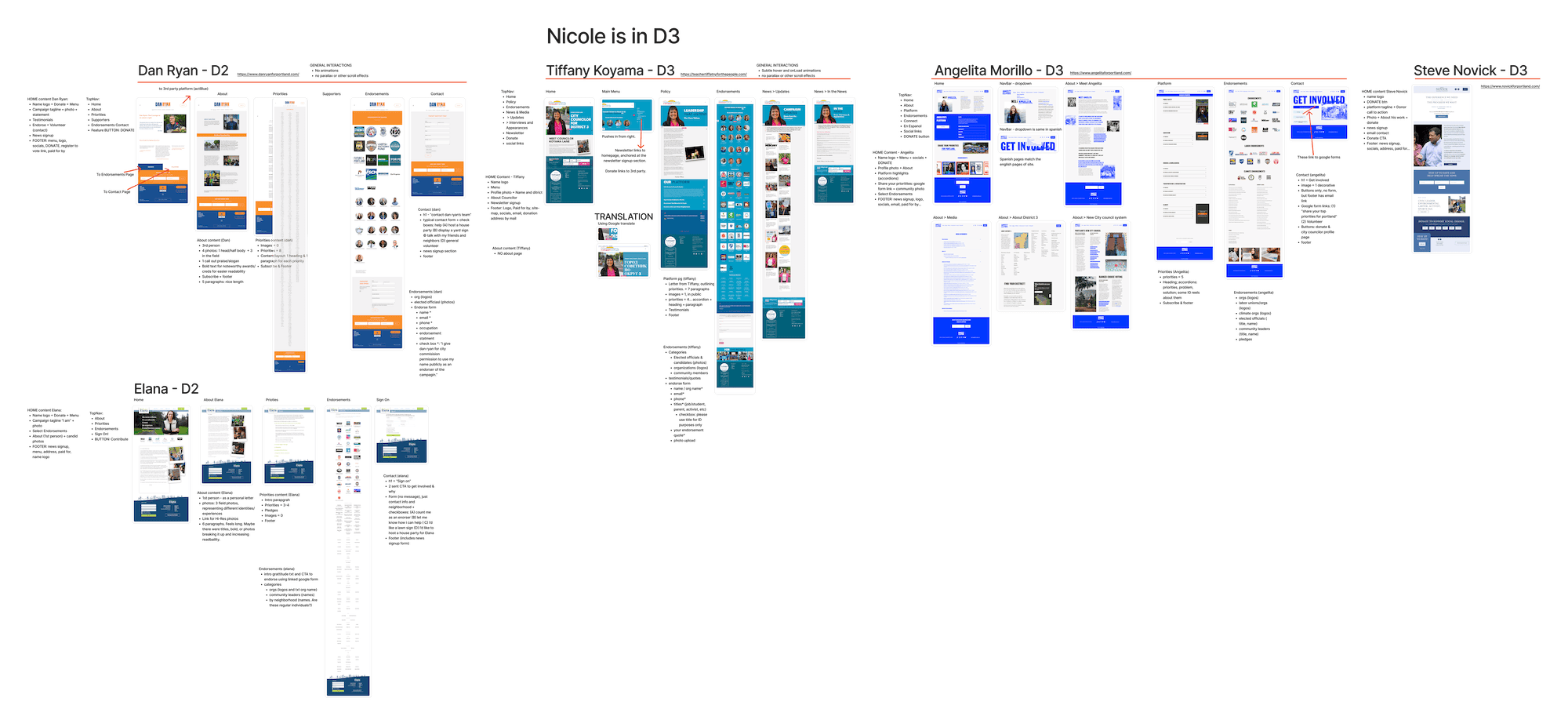
Analyzing competitor campaign sites, we created a table of most commonly expected UI patterns, and content sections. We wanted our design to feel familiar and belonging to the political arena, while still standing out in tasteful ways.
Design
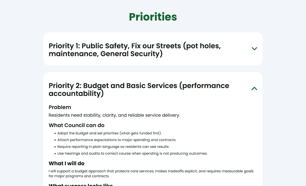
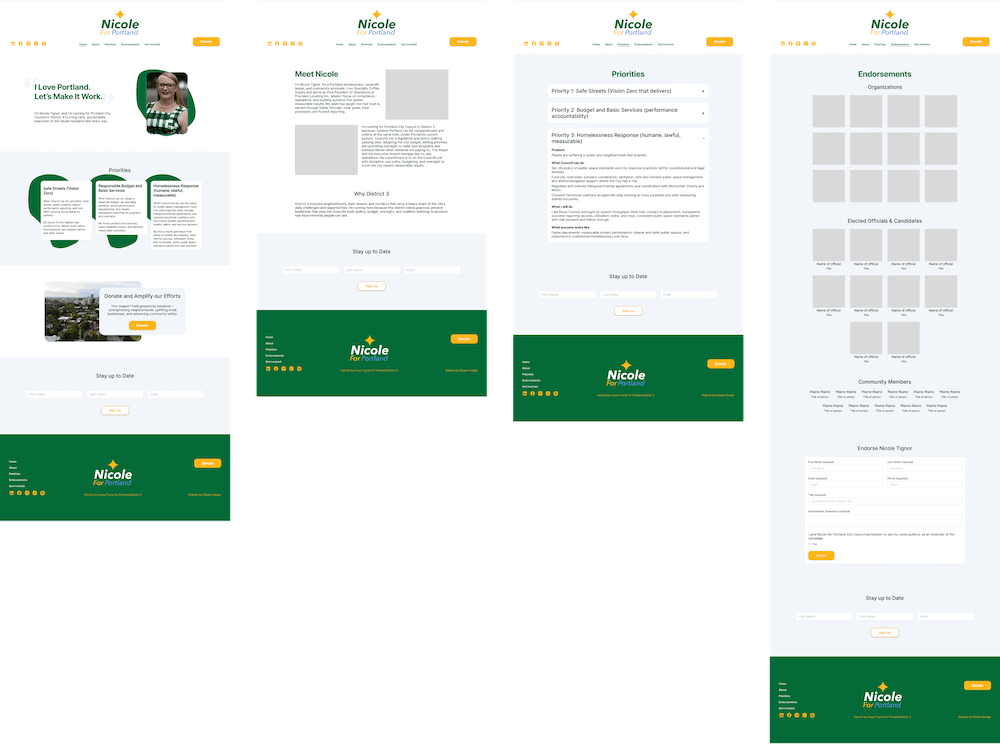
The design focused on making information easy to find and comfortable to read. Generous negative space gives the content room to breathe, while organic shapes create visual interest without competing with the information.
Clear hierarchy and straightforward navigation help visitors quickly understand the campaign and find the information relevant to them. The design was also developed responsively, recognizing that visitors could arrive on either mobile or desktop devices.
Development
The website was built in two stages. Stage one provided a simple introduction, candidate information, and a prominent pathway to the campaign's donor platform. This allowed the campaign to begin fundraising while the second stage was being designed and developed.
For the full site, I used custom code to integrate Google Translate into the website's existing visual system. The translation control was designed to feel like a natural part of the interface rather than an external widget.
The final development also included a CMS designed for easy updates, responsive behavior across devices, SEO implementation, and testing of the site's forms, links, and mobile and desktop experiences.