Services
- Marketing Strategy
- UX/UI Design
- Web Development
- SEO
- Content Mgmt System
Summary
Background
Wholemovement is a company evolving out of an existing sole proprietorship.
Bradford has operated wholemovement for decades as the umbrella for his research and work on circle folding, expressed through books, public speaking, and workshops. Ash builds on the same circle folding process through her own artistic practice and workshop facilitation. While they share a foundational methodology, their work reaches different audiences and expressions.
Together, they set out to unify their work under a single brand and website: wholemovement. They partnered with MGalen Design to clarify their brand, distill their business objectives and audiences, and design a website to support those goals.
Challenge
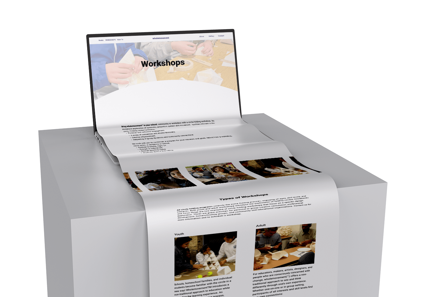
The primary challenge was synthesizing two distinct yet related practices into a single, cohesive digital experience. Bradford’s work centers on philosophy and book sales, requiring a clear path to purchase, while Ash’s work focuses on workshops, requiring intuitive UX flows and marketing funnels. Each also serves multiple audiences with different motivations and entry points.
Additionally, both stakeholders are artists with strong aesthetic perspectives. This required thoughtful facilitation to find alignment—balancing their preferences while grounding decisions in web design best practices.
Results
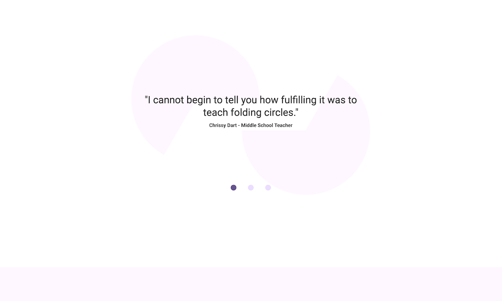
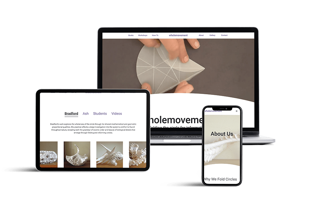
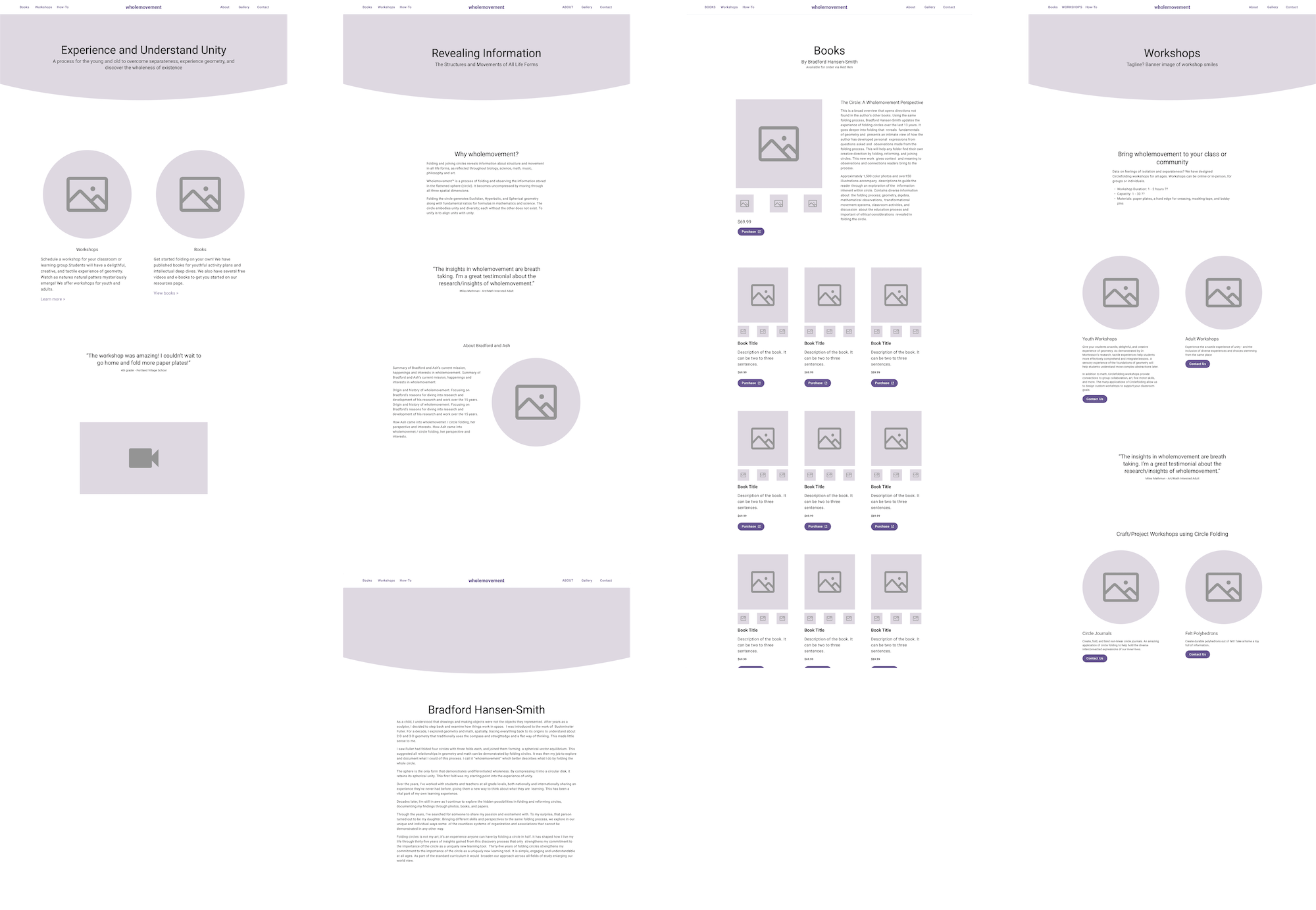
The final website opens with a video banner showcasing the time-based process of circle folding—the foundation of wholemovement’s work. Circular forms subtly echo throughout the design, from the curved edge of the hero section to abstract quotation marks derived from a circle with a segment removed.
The result is a clean, calm, and intentional user experience, with streamlined pathways guiding visitors toward key actions: exploring books and booking workshops.
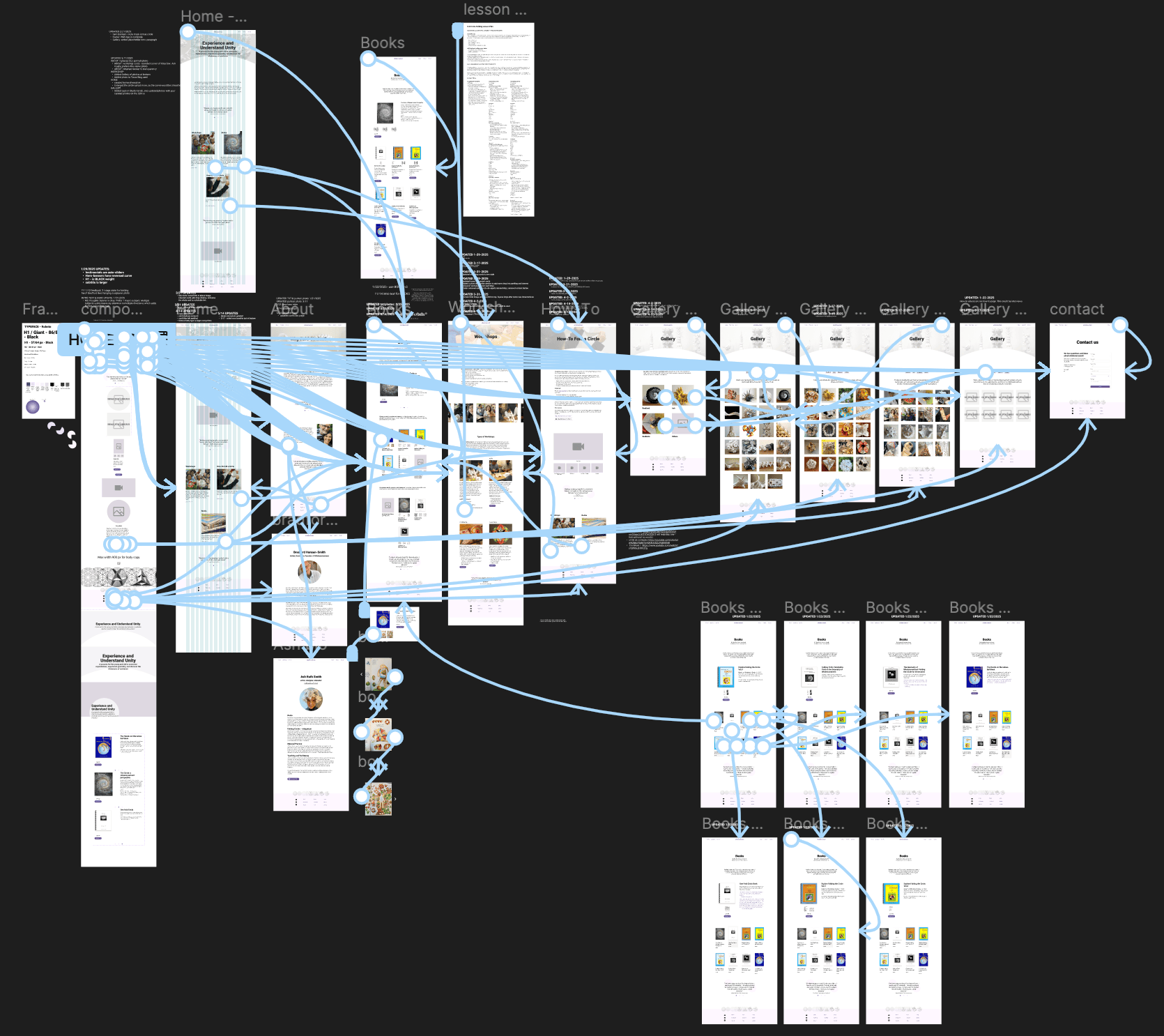
Process
Strategy
A key early focus was distilling the goals and identities of two existing entities—wholemovement and Radical Circle Arts—into a unified direction. Through facilitated stakeholder conversations, an existing content audit and industry research, we defined two primary audience groups based on their interests: books/self-guided learning and workshops, each with additional subgroups (such as adults and youth facilitators).
With clear audiences and business objectives established, we developed a strategy to guide both structure and design decisions.

Design
The design balances warmth and clarity. We used subtle background contrasts, soft transitions between sections, and smooth micro-interactions to create a gentle, welcoming experience. Circular motifs appear throughout as a unifying visual language.
Content was carefully distilled and spaced to reduce cognitive load, allowing visitors to move through the site with ease. A neutral typeface ensures readability, while a soft lavender accent color adds a sense of warmth and approachability.
Development
Because wholemovement’s books are sold through Red Hen Toys, we designed a product experience that keeps users engaged on the site while providing clear pathways to purchase externally. Each book page offers context and information before linking out, maintaining continuity in the user experience.
Because wholemovement’s books are sold through Red Hen Toys, we designed a product experience that keeps users engaged on the site while providing clear pathways to purchase externally. Each book page offers context and information before linking out, maintaining continuity in the user experience.
Results
The wholemovement website brings two complementary practices into a unified digital space—honoring their shared foundation while creating clarity for distinct audiences.